Process and breakdown
Since some of you requested this, I’m going to briefly share my process for a portrait painted from life. I really enjoy putting this together, so let me know if you guys want to see more tutorials like this on any specific subjects.
First of all, make sure you have enough light on the subject and on your canvas/paper. I’m painting on my laptop in this particular case, so lighting my canvas is not an issue. Ideally, you want to have a light source opposite your drawing hand, so you avoid having a cast shadow across your piece.

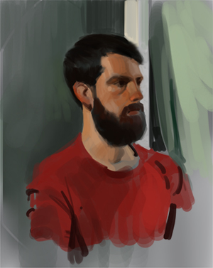
You might notice I start painting the big shapes straight away. Ignore all details in this stage and focus on getting the proportions right. Compare shapes to other shapes, see if your negative spaces match the ones on the subject.
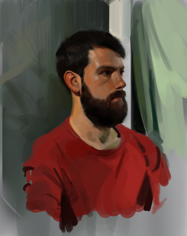
If you don’t feel confident enough to do that, doing linework is absolutely fine. There is no right way to start a painting. In this particular case Ricardo’s beard and hair create strong and graphic shapes, so blocking them seemed like a good way to start. Spend some time in this stage and make sure your shapes are accurate. Use mental horizontal and vertical alignments to check if your drawing is correct. Simplification takes a lot of practice and experience, so don’t worry if you misjudge and get it wrong. (I got it wrong!)
Once you have some information that you can work with, start thinking about lighting. Where is the light coming from? Is there a main light source? Which planes of the face are facing the light and which are turning away from it? I’m not going to dive in the subject of light here, but I recommend that you check out “Color and Light” by James Gurney and “How to Render” by Scott Robertson. Definitely two of the best books on the subject out there.
Human skin is really tricky to paint because of its translucent qualities. Adding some saturation to areas like ears, cheeks, nose is a good way to start, but if you want to push it to the next level, try and really pay attention to the subtle color variations within the skin.
Something else you can do is adding interest and guiding the viewer’s eye by playing around with contrast and edges. You can see that I’ve added a white bar just behind him, which is the brightest part of the image and that helps making his silhouette more prominent. I’m also keeping his hair and beard relatively softer, so they read as a different material. If you are not sure about your edges, try squinting down and determining which one is the hardest and make sure all the other ones are subordinate in terms of softness. A rule of thumb is that you don’t want anything too crisp when you’re painting something organic (i.e. a human being).
I hope you guys found this helpful. Let me know what do you want me to talk about next.